Richard Kuchinsky is straightforward about race shirts. “Most of us runners have a drawer full,” says the Toronto-based designer. “We all have so many shirts, and so few get worn because most are, well, ugly.” As the head of the Directive Collective and a dedicated runner, Kuchinsky challenged himself to create a shirt for the Scotiabank Toronto Waterfront Marathon that runners will be excited to wear not just while running.
“It’s important to runners that it [the shirt] stands out in a good way.”
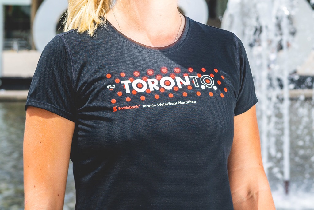
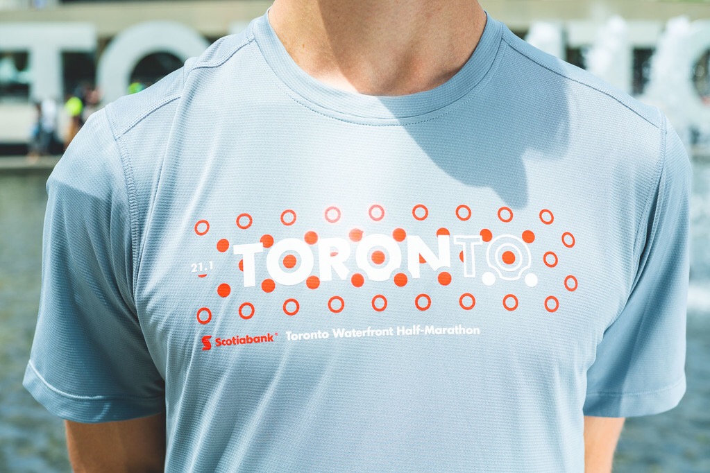
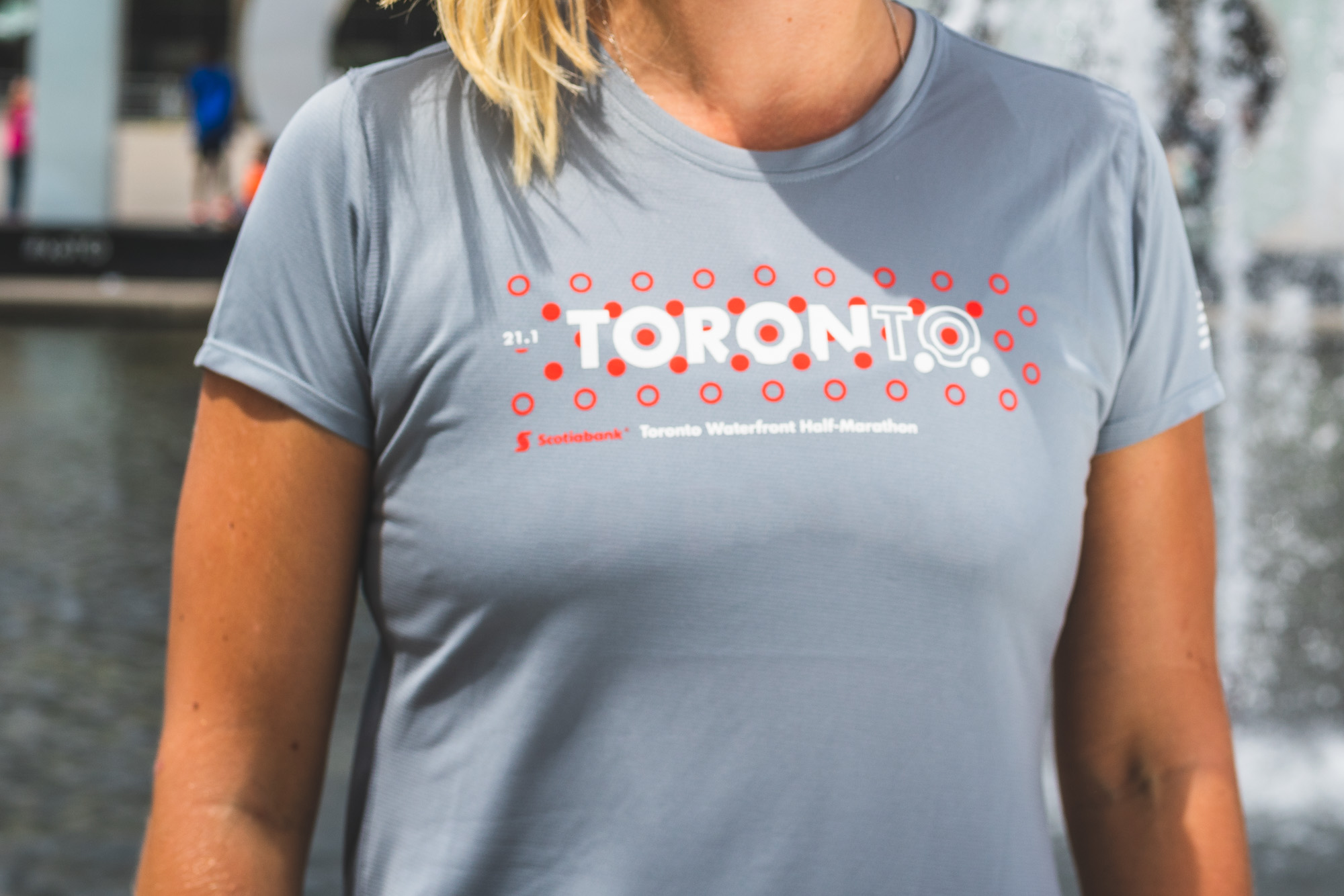
The New Balance shirts (specifically, the Accelerate Short Sleeve shirt, with NB Dry material) come in three colourways, for the 5K (red), half-marathon (gray) and marathon (black). New Balance became the official athletic sponsor of the Scotiabank Toronto Waterfront Marathon in 2017.
“When I sat down and started designing the shirt, I knew I wanted it to be something I would want to put on when not running,” Kuchinsky says, pointing out that it’s the true high-water mark of a great piece of running apparel. He then set out to create a look that runners would be proud to wear and feel connected to, particularly when seeing another runner wearing it. Kuchinsky travels a lot for racing (he’s run dozens of races in multiple countries), so he also saw the shirt as being a potentially strong ambassador for the city it comes from. “It had to be a look I could wear while travelling,” he says. “I love representing home while I’m away.”
Kuchinsky started thinking about the best races in the world as a starting point for the inspiration. “They combine everything that’s good about a city,” he says, referencing Boston and New York’s marathon identities. And he knew that it had to be design-led. “It’s important to runners that it stands out in a good way,” Kuchinsky says.
“You’re one runner, a dot, in a sea of thousands during a marathon, and you rely upon so many people as a runner, and you’re a part of a bigger picture.”
The look began with the Kuchinsky’s first creation for Canada Running Series, the Banque Scotia 21k de Montreal shirt. His approach was to look at the larger picture, wanting to inspire runners to explore all the races of the Canada-wide series, and highlight what makes each race special, and important locally. “The Montreal shirt was heavily influenced by the Bucky Dome,” says Kuchinsky of the iconic ball-shaped structure designed by architect and futurist visionary Buckminster Fuller. The dome, now a skeletal structure, was meant to house communities in an environmentally controlled bubble. It’s become an enduring symbol of both Expo ‘67 and the city, and can be seen throughout much of the 21K course. “It had such a huge influence on both design and now the experience on the Montreal course,” Kuchinsky says, that it felt like the perfect way to connect design to the identity of both the city and that race.
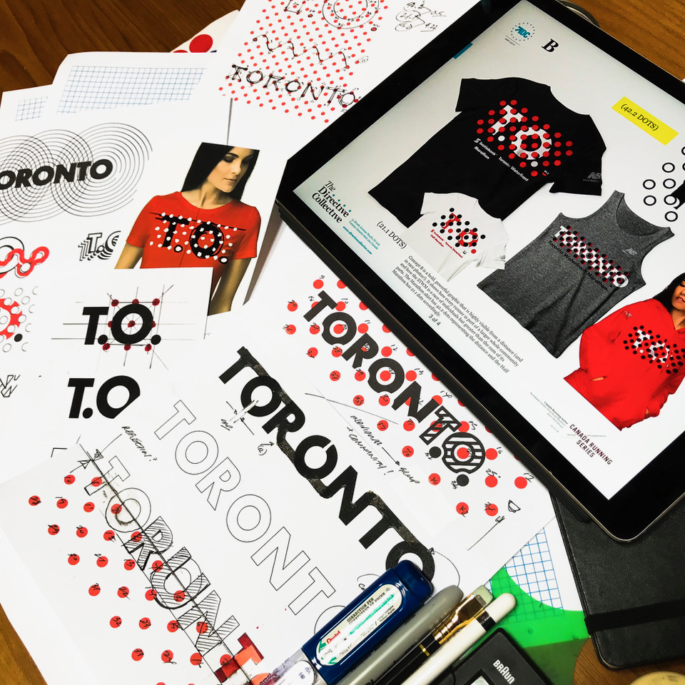
That led Kuchinsky to contemplate how a series of aesthetically-related shirts would tie together the races in the series. “How cool would be if every race shirt had a bold pattern, and that you’d want to collect all of them from the series,” Kuchinsky says.
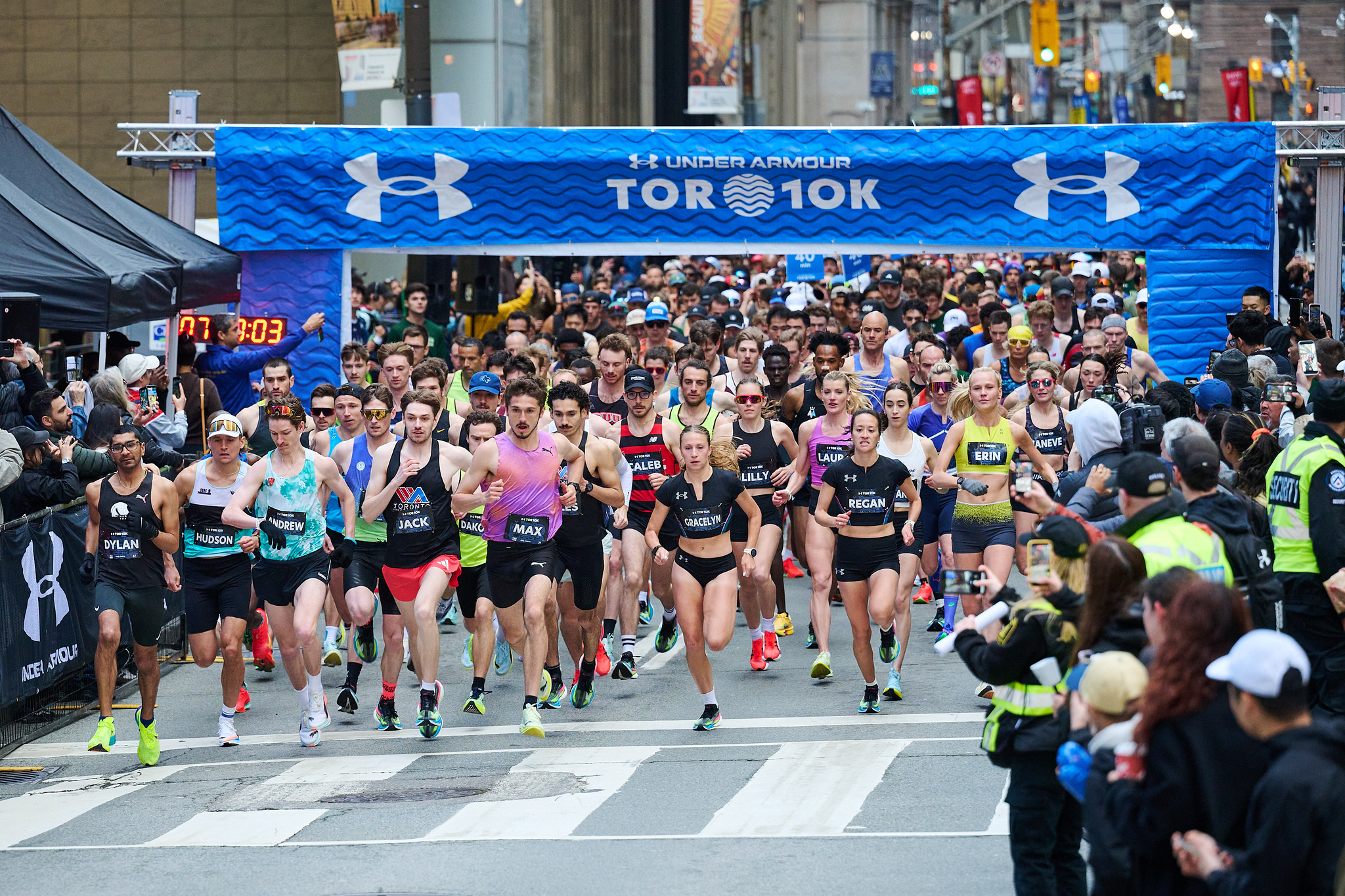
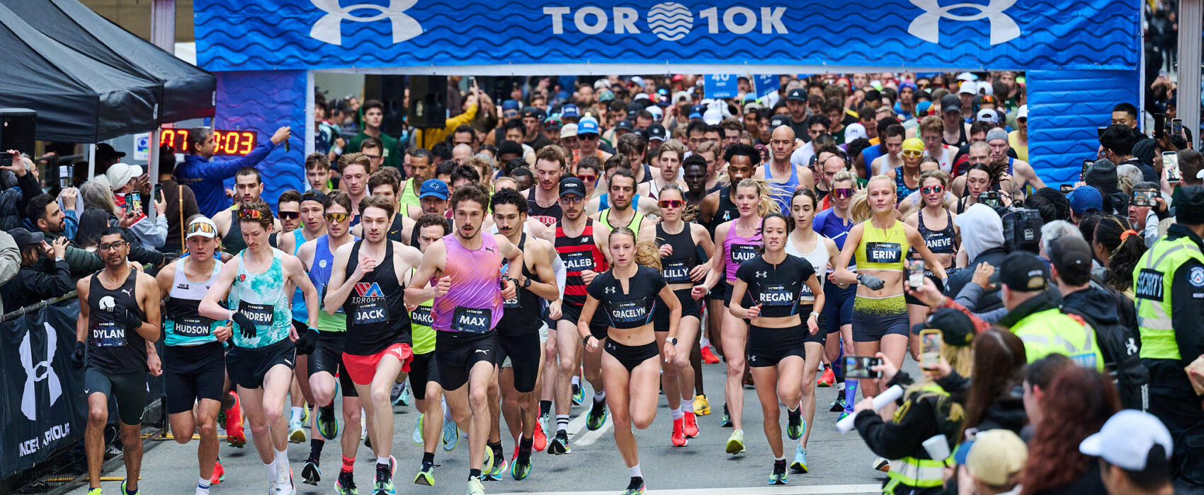
For Toronto, Kuchinsky was drawn to the city’s extraordinary diversity, and how a running event is about multiple individuals coming together to do something great. “The city is about multiple elements, all these different people, groups, crews and neighourhoods,” Kuchinsky says. “You’re one runner, a dot, in a sea of thousands during a marathon, and you rely upon so many people as a runner, and you’re a part of a bigger picture.”
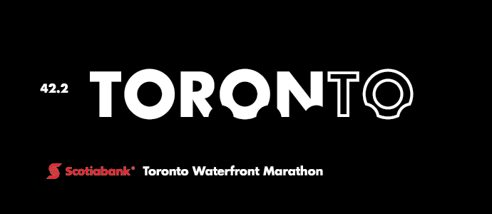
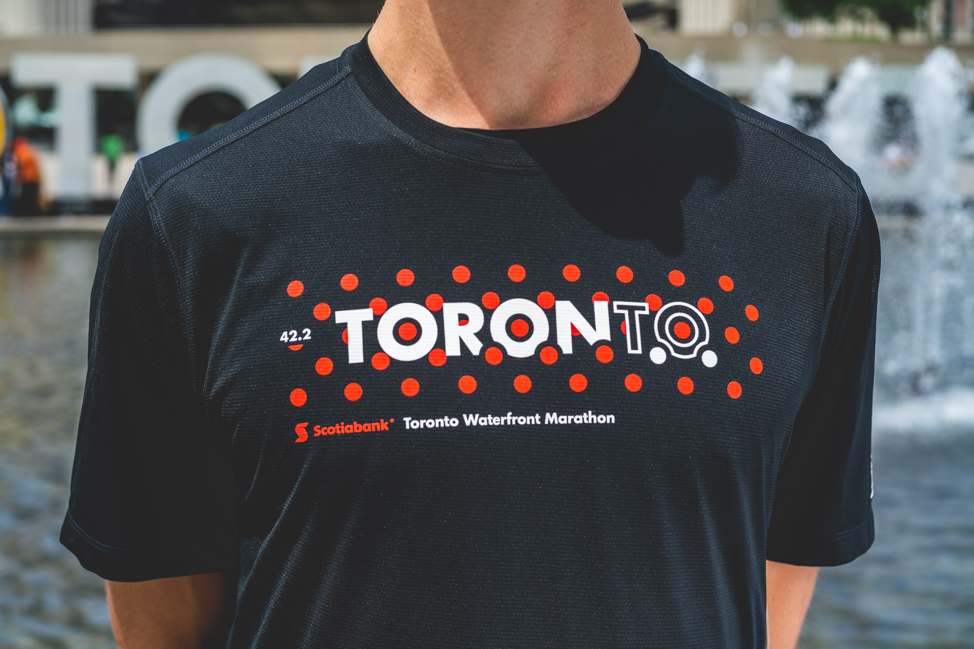
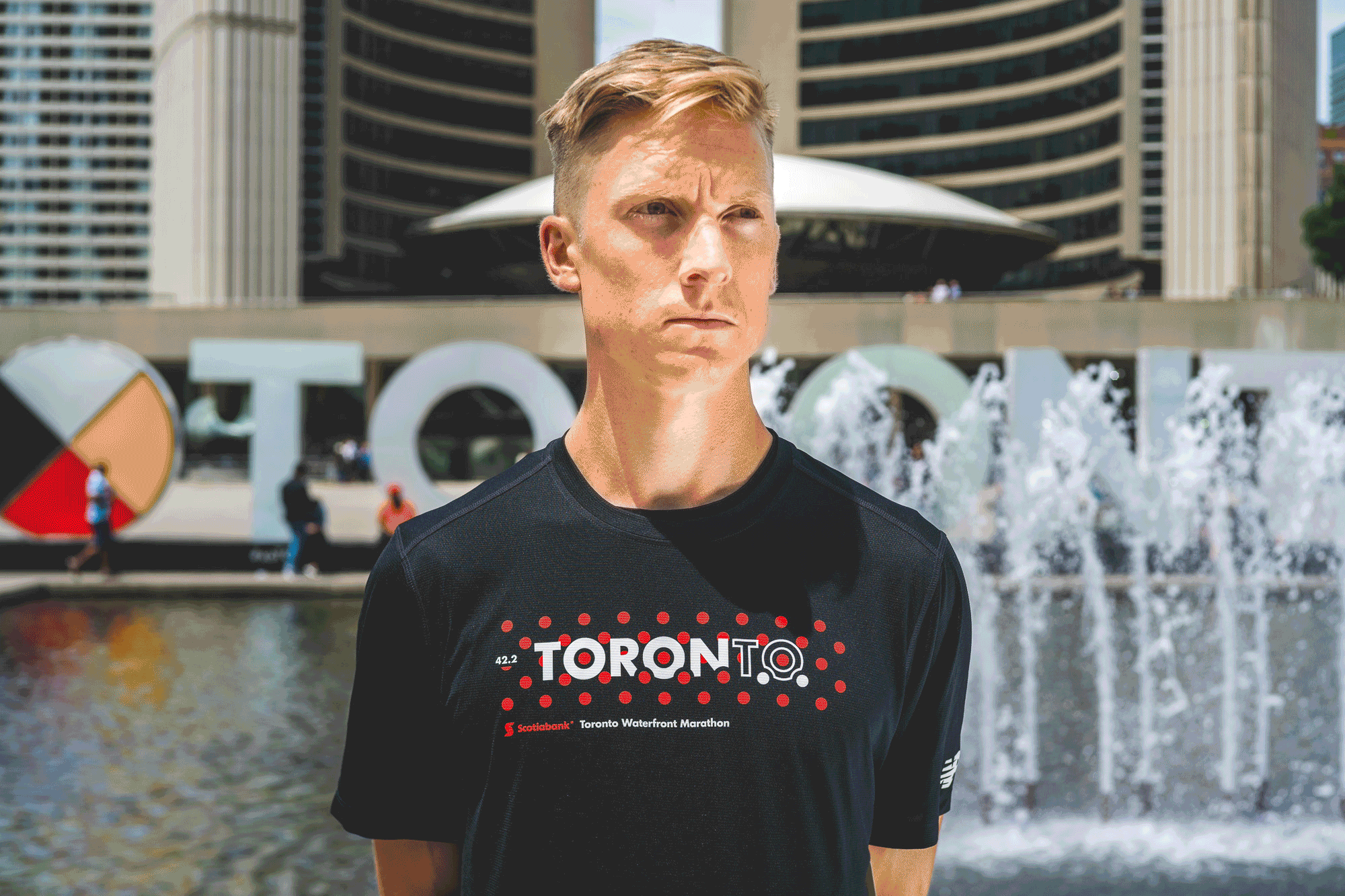
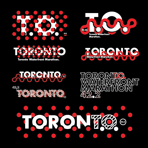
From an initial napkin sketch came a series of three unique designs for each of the 5K, half-marathon and 42.2K experiences, with a series of dots brilliantly illustrating the distance. (Notice the 0.2 of a dot for the marathon T-shirt?) The lettering of ‘Toronto’ mimics that of the sign at Nathan Phillips Square, located metres away from the STWM finish line(s). Plus, the two off-coloured dots between the ‘T’ and ‘O’ shorten Toronto to its two-letter name, T.O.
Marathon
Half-marathon
5K
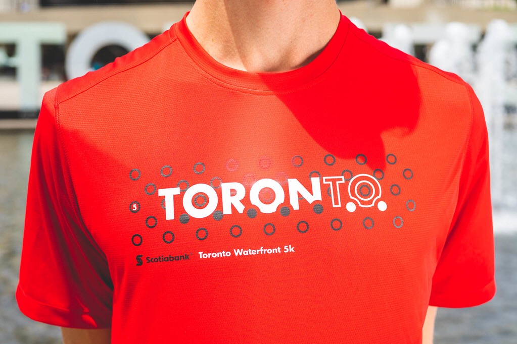
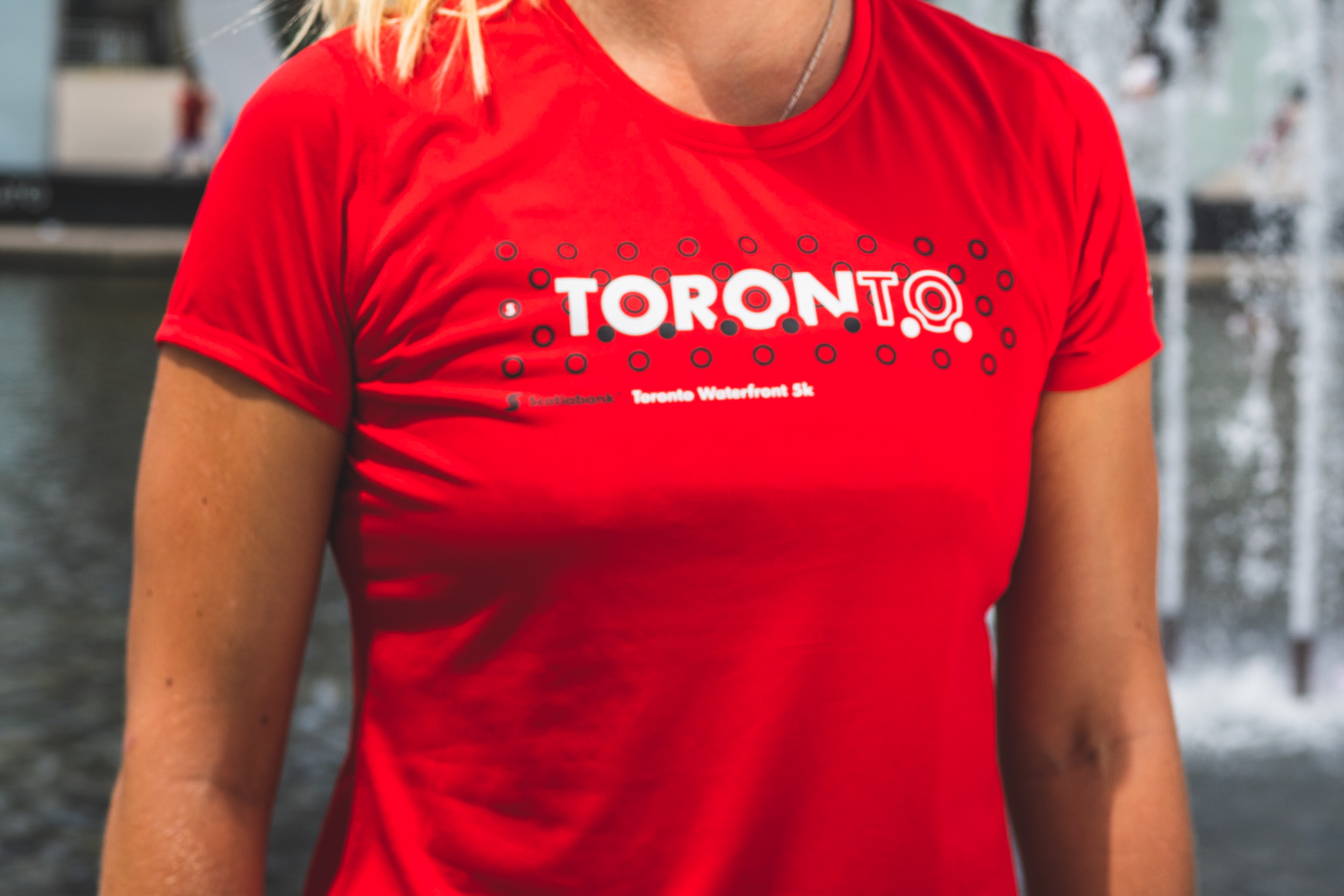
And, of course, there’s a subtle riff on the city’s nickname. “If you see people wearing it, you can read it from 20 feet away, so it stands out in a photograph,” Kuchinsky says, as he recognizes that there’s nothing worse than a race shirt that gets lost in a crowd. “I felt the design needed to be graphic, bold, strong and, most importantly, simple,” he says. “It’s one kilometre at a time, represented by one dot at a time; breaking it down into each moment in a race. Like running, you don’t need a lot of excess.”
Want a T-shirt for yourself? Sign up for the 2018 Scotiabank Toronto Waterfront Marathon right here. Race date is Oct. 21, and each finisher will receive one of these unforgettable medals.